A gallery wall is the most personal decorating move there is. Where a single big print can feel like it came with the room, a thoughtfully built collection of art, photos, and found objects tells the story of the people who live there — where you have been, what you love, who you miss, what makes you laugh. Better still, it is one of the most budget-friendly ways to transform a large blank wall. The catch is that gallery walls can go wrong in famous ways: crooked clusters, awkward spacing, a mess where a story should be. These ideas will help you get it right the first time.
Choose Your Gallery Style Before You Hammer Anything
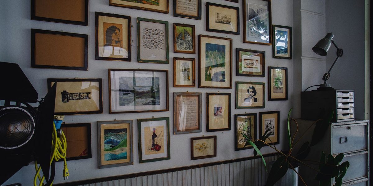
Gallery walls come in distinct personalities, and choosing one up front makes every later decision easier. The grid is the most formal: identical frames, identical mats, hung in precise rows — striking with a series like botanical prints or black-and-white photos. The salon style is its opposite, a floor-to-ceiling organic cluster of mixed sizes and frames that feels collected over decades. Between them sits the classic organized-eclectic approach: varied frames and pieces arranged around an invisible center line, balanced but relaxed.
Ledge galleries deserve a look too — one or two picture ledges layered with leaning frames let you rearrange endlessly without new holes. Match the style to the room's mood: grids suit offices, hallways, and modern spaces; salon walls love dens, stairwells, and libraries; relaxed clusters work almost anywhere. Committing to a style first prevents the most common failure, which is a wall that cannot decide what it wants to be.
Gather More Than Art
The most memorable gallery walls mix framed art with objects that have texture and history. Raid your own life before any store: children's drawings elevated by proper mats, a page from a vintage atlas, concert stubs and postcards in small frames, a grandmother's embroidery, the hand-lettered menu from a favorite trip. Dimensional pieces — a small round mirror, a woven basket, a ceramic plate, a brass sconce, a pressed-flower frame — break up the flatness and catch light differently through the day.
- Family photos gain cohesion printed in all black-and-white or all warm tones
- Thrifted paintings and frames add instant age and character for very little money
- Small shelves within the arrangement hold tiny plants or sculptural objects
- A single oversized letter, clock, or hat adds a wink of humor
Aim for a loose theme — a shared palette, a common subject, or a consistent frame metal — so variety reads as curation rather than clutter.
Frames themselves deserve thought. Mixing wood tones with one metal finish keeps things lively but cohesive, and repeating any single frame style two or three times across the wall ties the whole collection together. Generous mats make small pieces feel important and give busy arrangements visual rest; a tiny postcard in a large matted frame often outshines a big print in a skimpy one. Thrift stores are full of solid frames that a coat of paint can unify in an afternoon.
Plan the Layout on the Floor, Not the Wall
Every professional hangs a gallery twice: once on the floor, once on the wall. Clear a space roughly the size of your wall area and arrange the actual pieces there, starting with the largest anchor piece slightly off-center and building outward. Keep spacing consistent — two to three inches between frames is the classic gap — and vary the placement of visual weight so dark, large, or busy pieces are distributed rather than clumped in one corner.
When the floor version sings, trace each frame onto kraft paper or newspaper, cut out the templates, label them, and tape the full arrangement to the wall with painter's tape. Live with the paper mock-up for a day; you will catch spacing problems and height mistakes while they still cost nothing. Mark each hanger location right through the paper, and your nails will land perfectly on the first strike. If measuring the hanger drop feels fussy, dab a little toothpaste on the frame's hanging hardware and press it to the paper — the mark it leaves is exactly where the nail goes.
Hang at the Right Height and Anchor It Well
The most common gallery wall mistake is hanging everything too high. The center of the overall arrangement should sit at average eye level — roughly fifty-seven to sixty inches from the floor — with the whole cluster treated as one piece of art for this purpose. Above a sofa, console, or headboard, start the lowest frames six to ten inches above the furniture so the grouping visually connects to it instead of floating away.
Use the right hardware for each piece: standard picture hooks for most frames, anchors for anything heavy landing between studs, and adhesive strips for lightweight frames on smooth walls where holes are unwelcome — renters, take note. Two hanging points per frame keeps pieces from tilting every time someone closes a door. A small level, or a strip of painter's tape as a straight-edge guide, turns the whole job from guesswork into assembly.
Give the Wall Room to Grow
The best gallery walls are never quite finished, and planning for growth is part of the design. Leave modest breathing room at the edges of your arrangement so new pieces can join without crowding, or choose a style like the salon wall that welcomes infinite additions. When a new print, a vacation photo, or a flea-market find arrives, audition it by leaning it near the wall for a few days before committing to a spot.
Editing matters as much as adding. If the wall starts to feel noisy, remove the two or three weakest pieces and let the survivors breathe — rotation keeps the display alive and lets stored pieces return later like old friends. Once or twice a year, straighten everything, dust the frame tops, and swap any photo that no longer earns its place. A gallery wall should evolve at the same pace your life does.
Match the Wall to the Room's Purpose
Different rooms invite different gallery energy. Stairwells are natural gallery territory: step the arrangement up along the diagonal of the stairs, keeping the center of each cluster at eye level from the treads. Hallways love rhythm — evenly spaced frames at consistent height turn a pass-through into a promenade. In living rooms, anchor the wall to the main furniture grouping; in dining rooms, larger and fewer pieces keep the mood composed rather than busy.
Bedrooms reward softer, more personal collections — think quiet palettes, texture pieces, and photos that make you happy at the start of the day. A kitchen gallery of small framed recipes, food prints, and a child's drawing of dinner is charming precisely because it is unexpected. Even a bathroom can carry a tiny three-frame cluster, where humidity-safe framing and a sense of humor both help.
Final Thoughts
A gallery wall rewards patience at the start and playfulness forever after. Choose a style, gather pieces with real meaning, mock the layout on the floor and then in paper on the wall, and hang the whole story at eye level with decent hardware. What you get is more than filled space — it is a living scrapbook that greets you daily and hands every guest a dozen conversation starters. Start collecting now; the wall will tell you when it is ready.